Overview
In Kitchener, Ontario you either know or are one degree separated from knowing Mike Farwell. Mike is a former news radio show host and an Ontario Hockey League commentator, but beyond his resume, he’s a brother who unfortunately lost both of his sisters to Cystic Fibrosis. To honour their legacy and to advance the disease’s research, in 2014, he started Farwell4Hire.
The premise is that every May (during Cystic Fibrosis Awareness Month), Mike rents himself out to community members to complete any odd-job – literally, any odd-job. Everything from raking leaves, washing cars, and mowing lawns, in exchange for a donation to Cystic Fibrosis Canada. Between 2014 and 2017, his entire campaign relied solely on word-of-mouth, which was great at first, but if Mike was going to reach his ambitious fundraising goal, he needed something more. He needed a brand.
The Challenge
Farwell4Hire had momentum and community goodwill but lacked a visual identity to anchor it. Without a brand, there wasn’t anything to put on a poster, nothing for a sponsor to stand behind, and no way to signal to new audiences that this was something worth paying attention to. The challenge was to create and build an identity from the ground up – one that could carry the campaign’s personality, expand its reach, and give the cause the presence it deserved.
The Solution
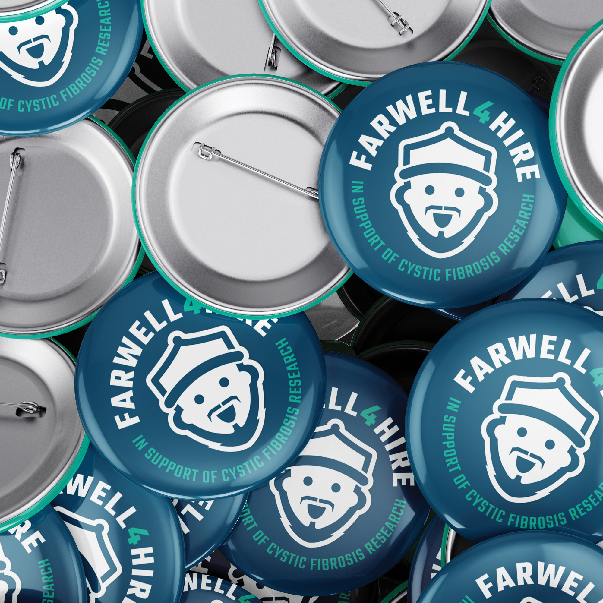
Mike is the brand, and the brand is Mike – literally, his name is in the title. Farwell4Hire doesn’t exist without him, so putting his face at the center wasn’t a stylistic choice; it was the only choice. A cartoon portrait of Mike in his signature ball cap became the everyday icon – but I knew that if we wanted this important cause to take off, this campaign would require even more customization, more personality, and even more Mike!
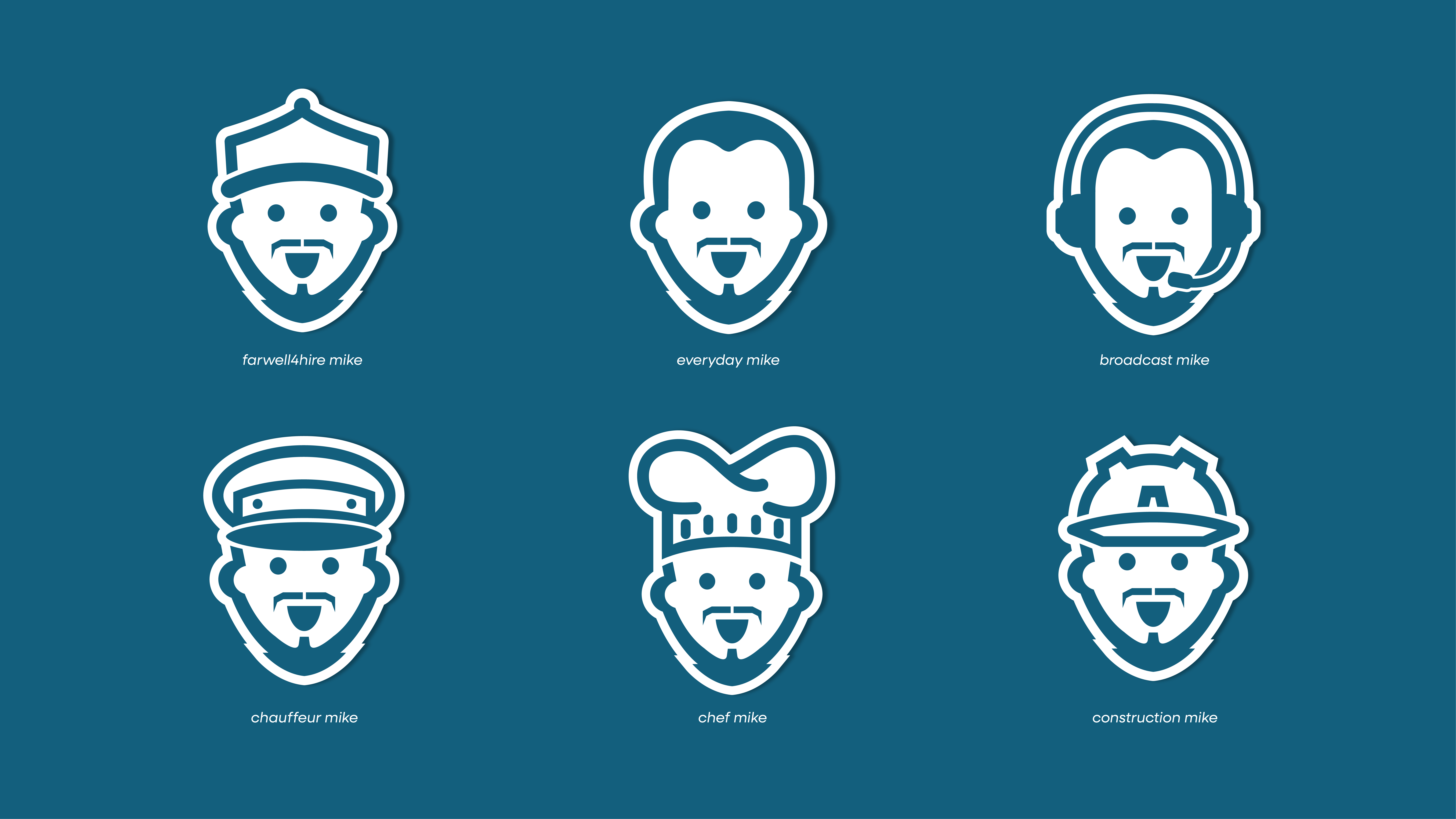
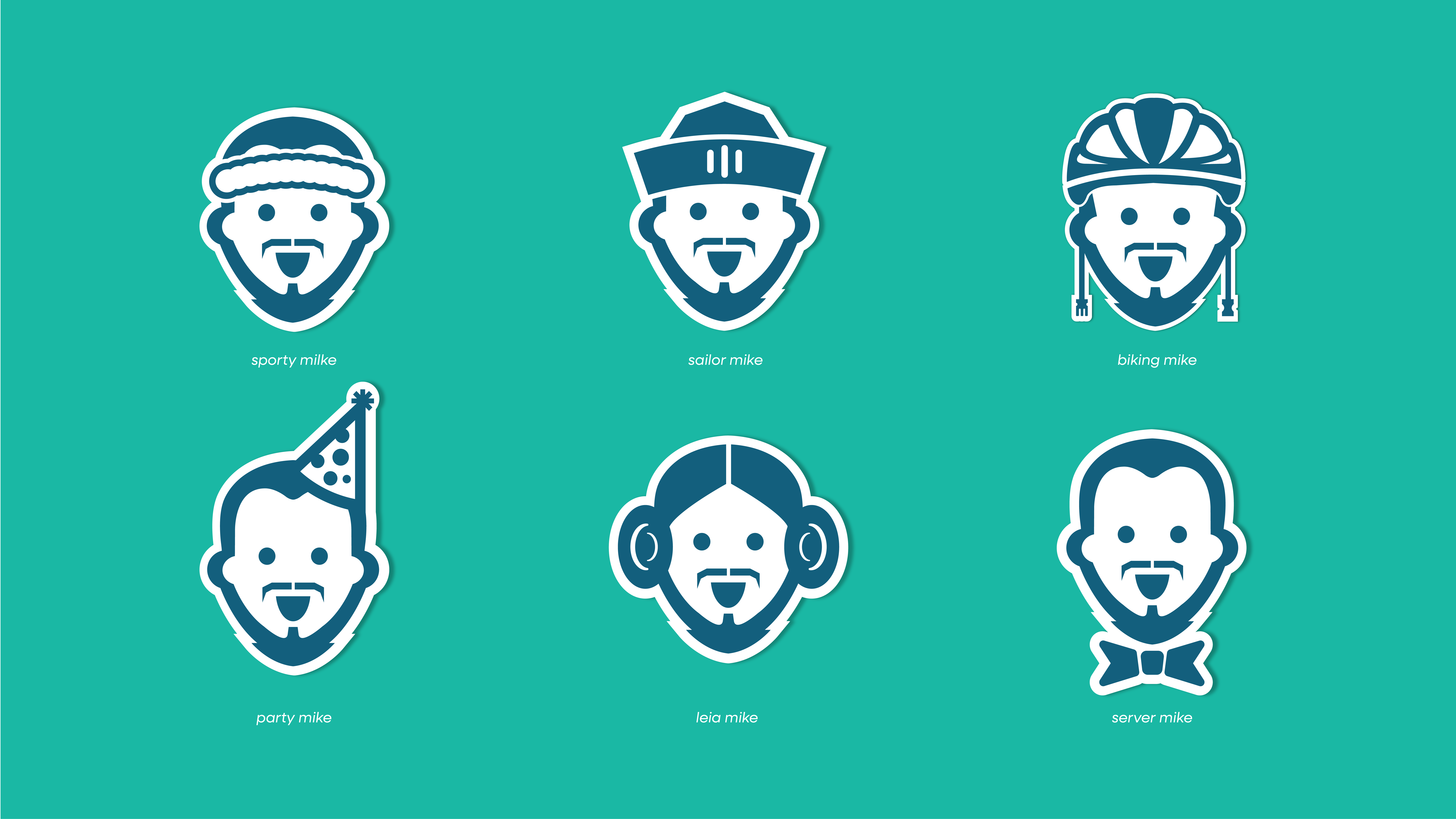
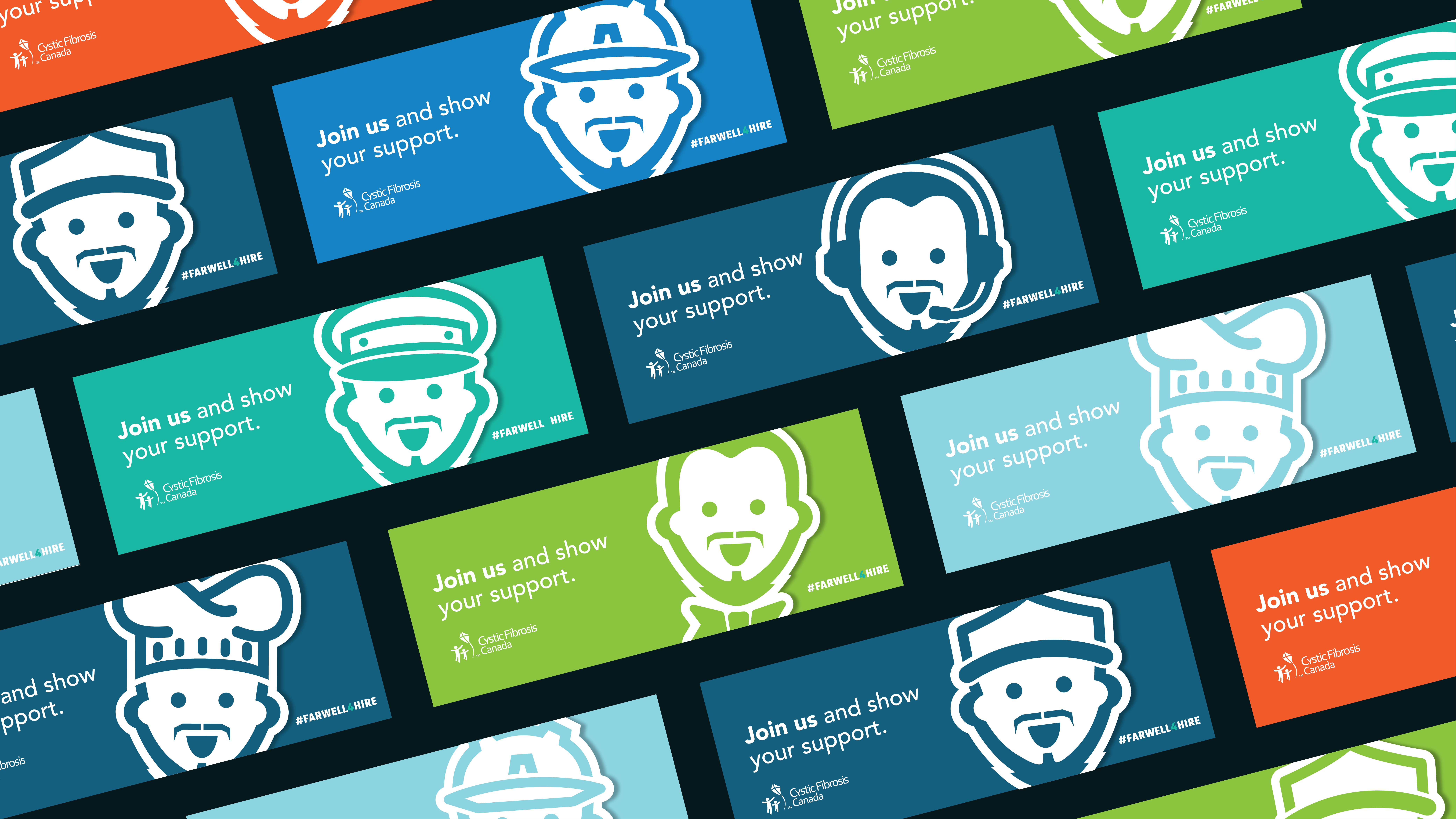
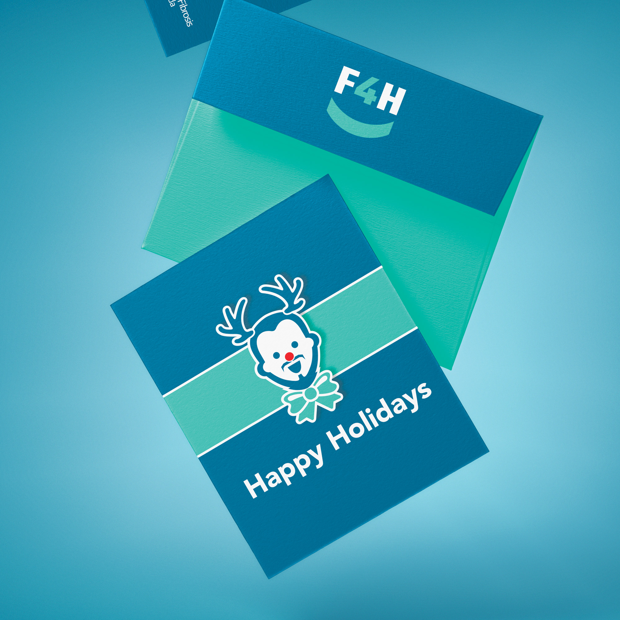
The final result: a growing collection of illustrated cartoon portraits, or icons, of Mike, each with their own recognizable uniform or accessory tied to a different odd job: chef, broadcaster, construction worker, chauffeur, sailor, cyclist, party host, and more. Each one designed to read instantly, and together they gave the brand a range and personality that a single icon never could. The ability to introduce new variations meant the brand’s identity wouldn’t become stale – leaving room to grow around special dates, seasonal moments, and future events – exactly what this cause needed to attract attention and reflect the person and thoughtfulness behind it.