Overview
The Grays Bay Road and Port Project is a proposed transportation corridor linking the northern community of Grays Bay to the southern part of Nunavut, opening a route to a deep-water port and, through it, to the rest of the world. It’s a partnership between the Government of Nunavut and the Kitikmeot Inuit Association, built to unlock resource development, trade, and quality of life across a region that has never had this kind of infrastructure before.
The Challenge
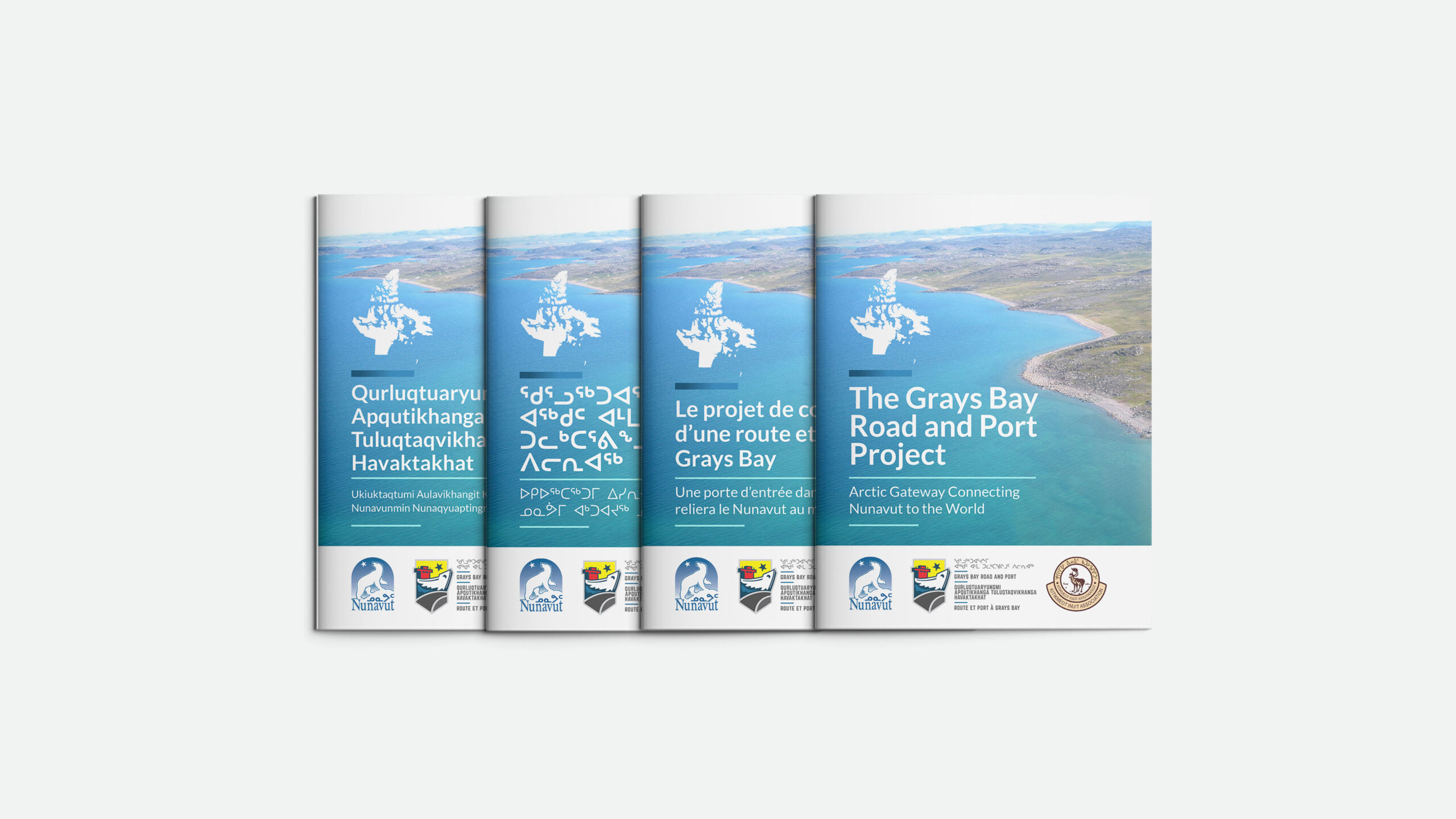
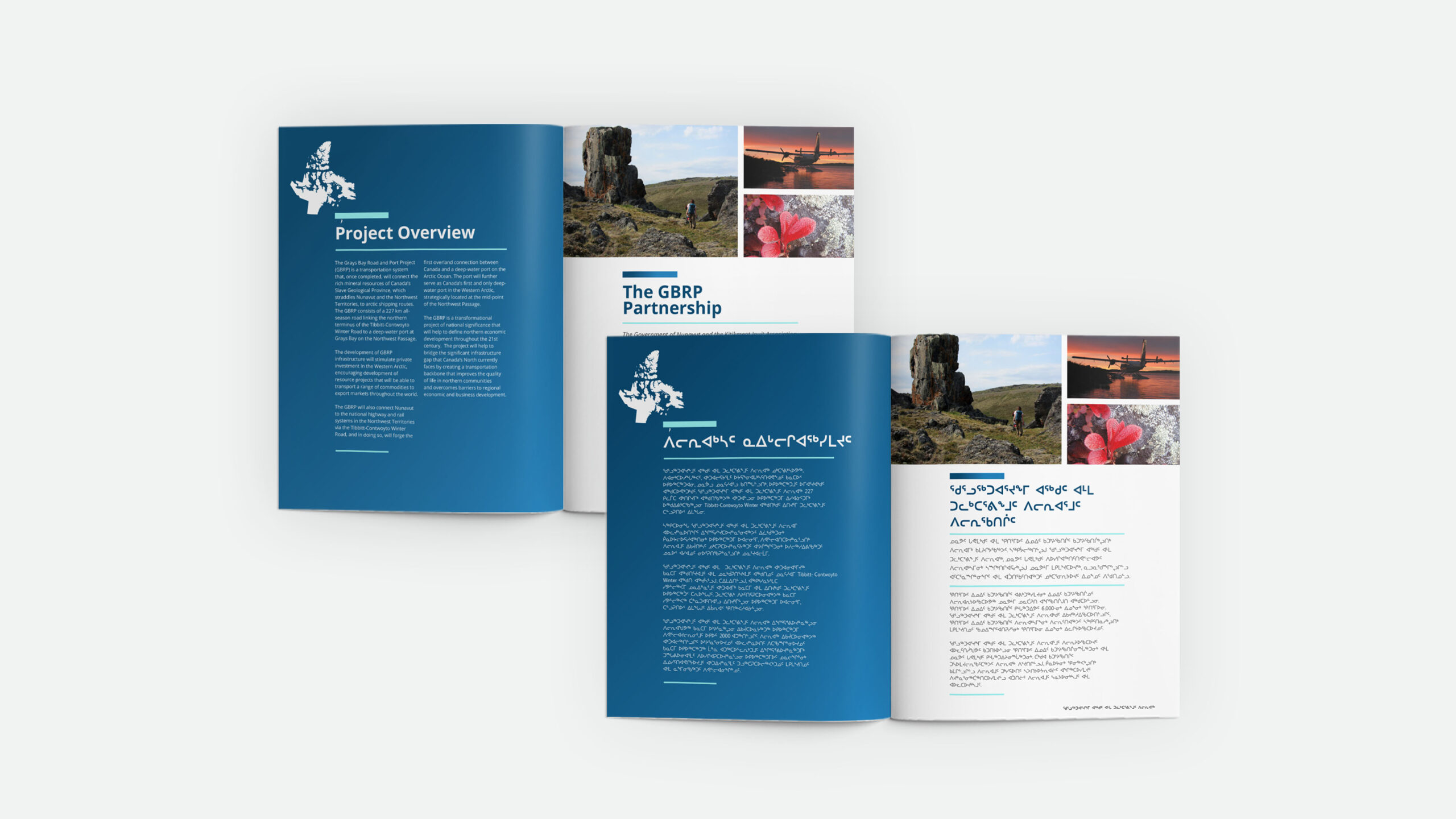
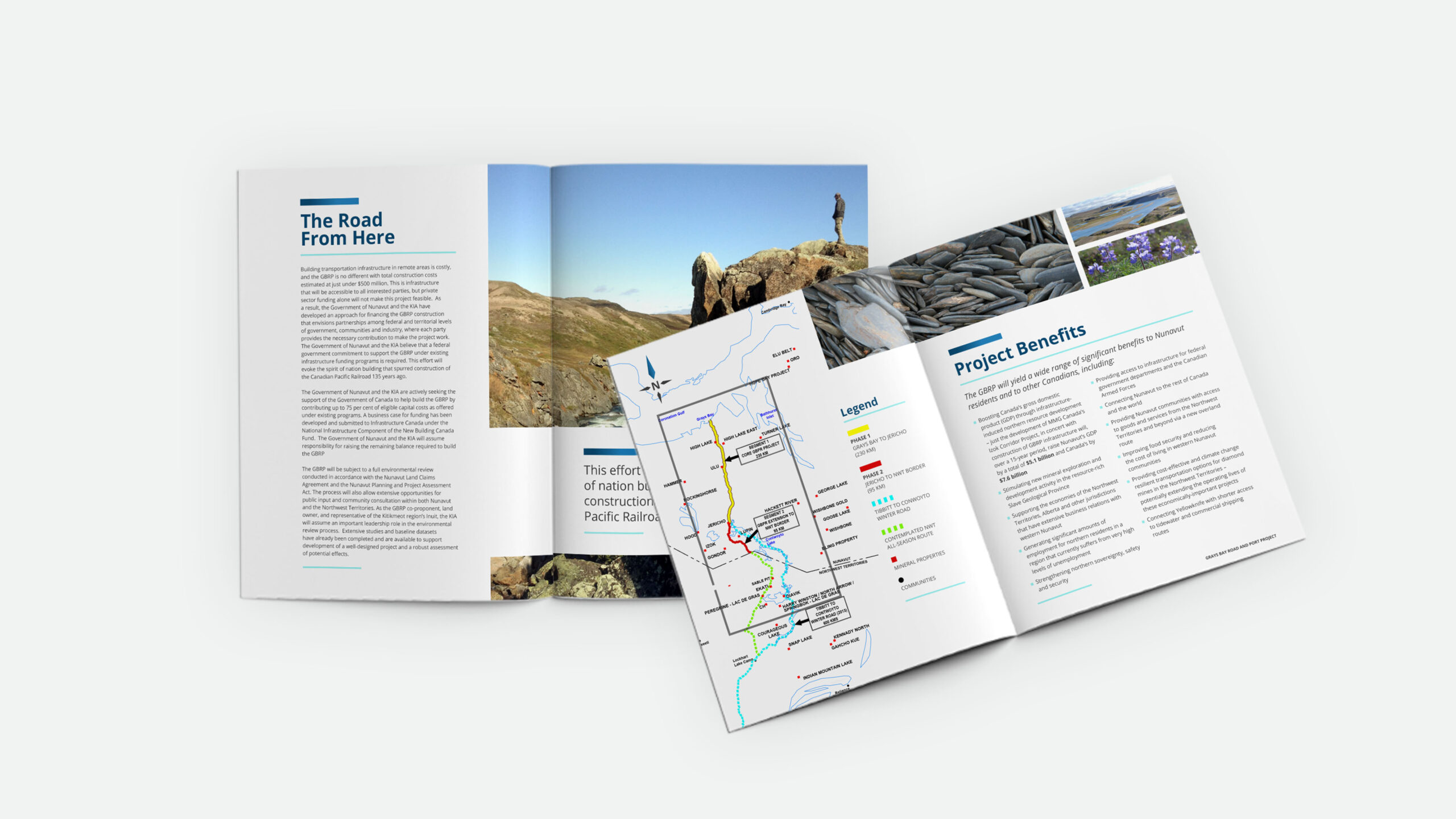
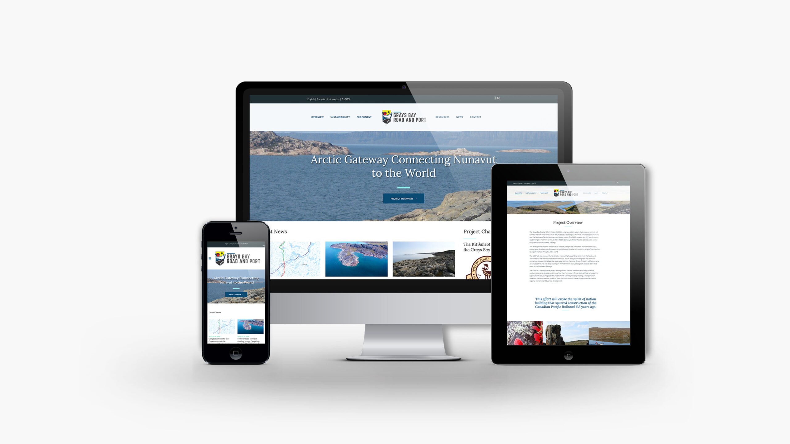
A project of this scale, chasing multi-million-dollar federal funding, needed more than a technical plan. It needed a multi-lingual identity that could be applied to a set of publications, a federal proposal, and a website. The challenge was to create an identity that embodied the people, languages, and cultures of the communities this project represented and impacted.
The Solution
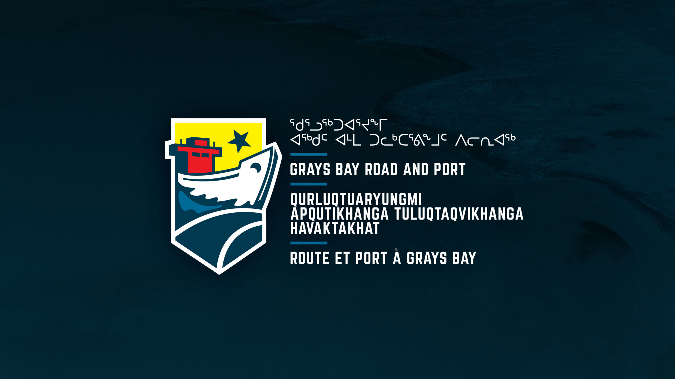
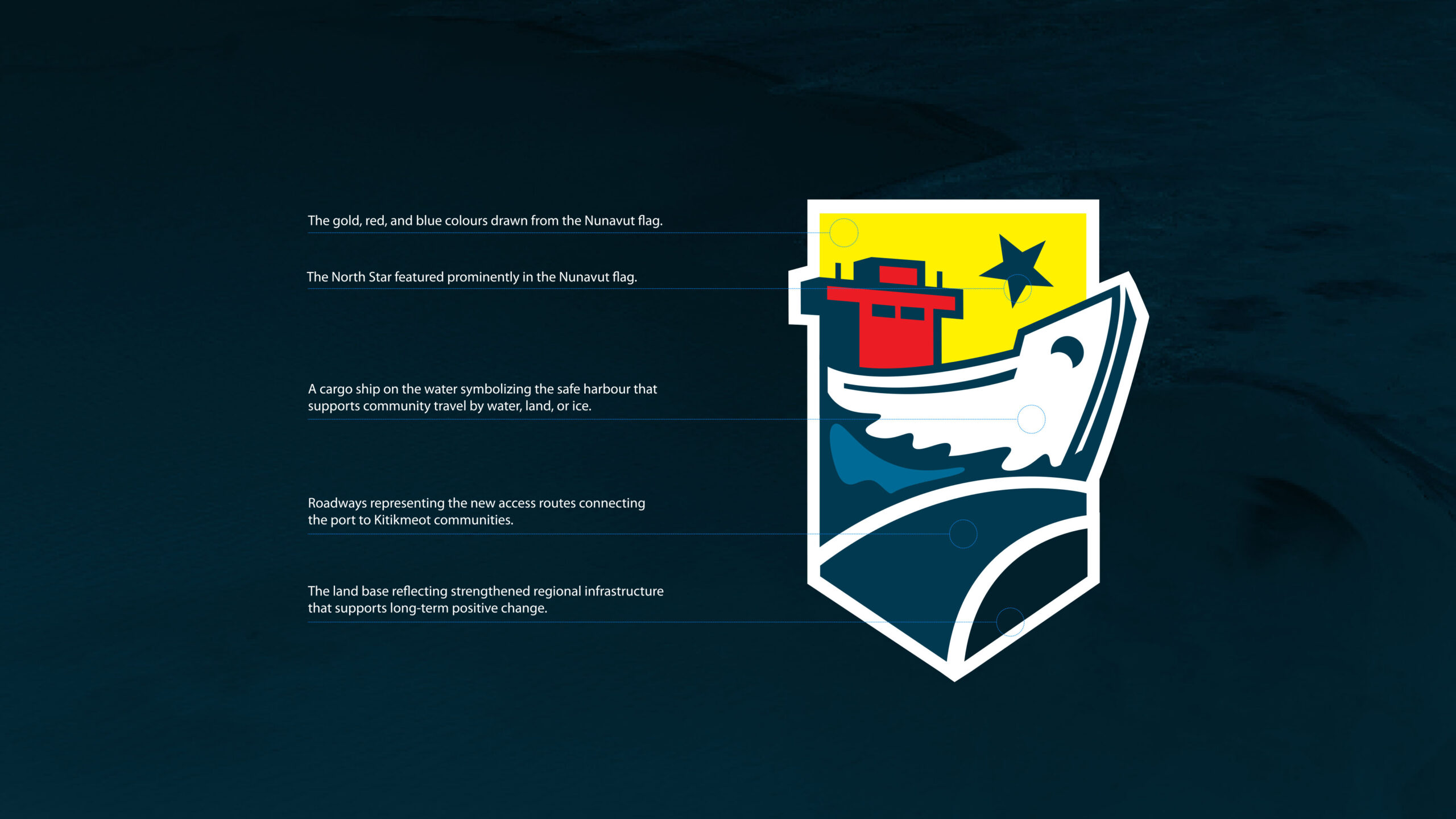
The goal was to create an identity composed of all the elements (air, water, land), and colours, that are a part of this incredible life-changing economic project. The icon includes a barge and waves (water), a road (land), and air (the star from the Nunavut national flag) – all (mostly) contained within the shape of a shield – a nod to the stability the government of Nunavut brings to this project. The colour palette is representative of those found on the Nunavut national flag – a symbol of pride to its people.
Due to the scale and impact of this project, the word mark needed to incorporate all four languages (Inuinnaqtun, English, Inuktitut, and French) – each represented individually but also as part of the collective whole. The publications and the multilingual responsive website were built using customized layouts that could grow or contract in all directions – dependent upon which language was being used. This flexibility in layout created a cohesive look and feel across every publication so anyone reading it could feel as though they were a part of it.