Overview
Since 2004, the family-run full-service law firm Hicks & Hicks has been a pillar of the town of Hanover, Ontario. Their commitment to providing the highest-quality legal representation mattered, and while they had a logo – they needed a brand, an identity for the community to connect with.
The Challenge
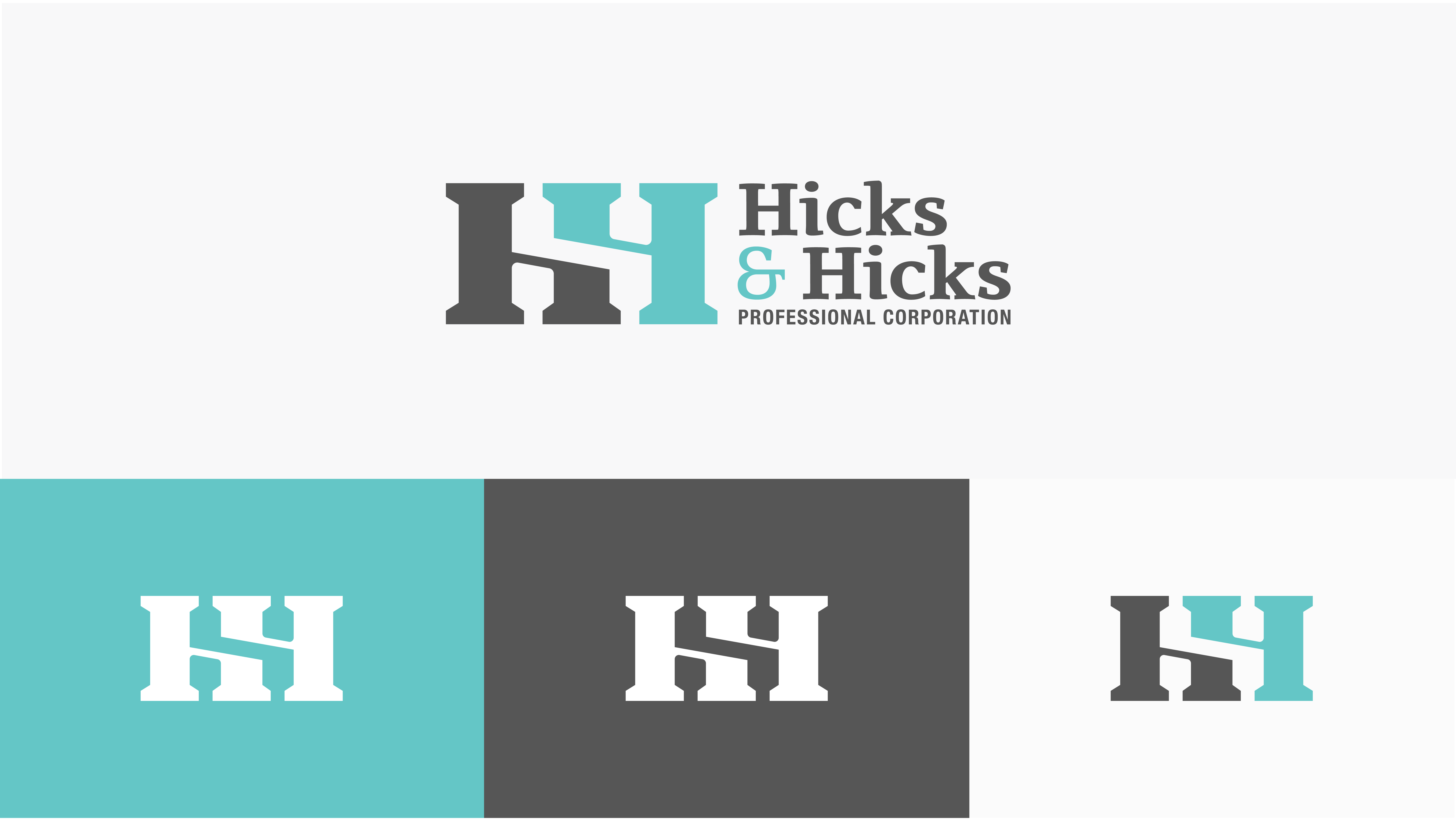
While Hicks & Hicks already had a logo, they wanted a new look – a multi-faceted identity-suite that would enable them to expand their professional services within and beyond their community. The challenge was to take the spirit of their original logo (two pillars forming the letter H) and rebuild it into something sharper, more versatile, that represented the firm’s commitment to serve their community.
The Solution
The goal was to refresh their logo, at the same time, build an identity. The logo embodied the symbolic nature of courthouse pillars, and the colour palette (a teal, dark gray, and white combo) reflected the modern sophistication of the people who worked there. The pillar icon was strong enough to stand entirely on its own, for socials, backgrounds, or overlay patterns.
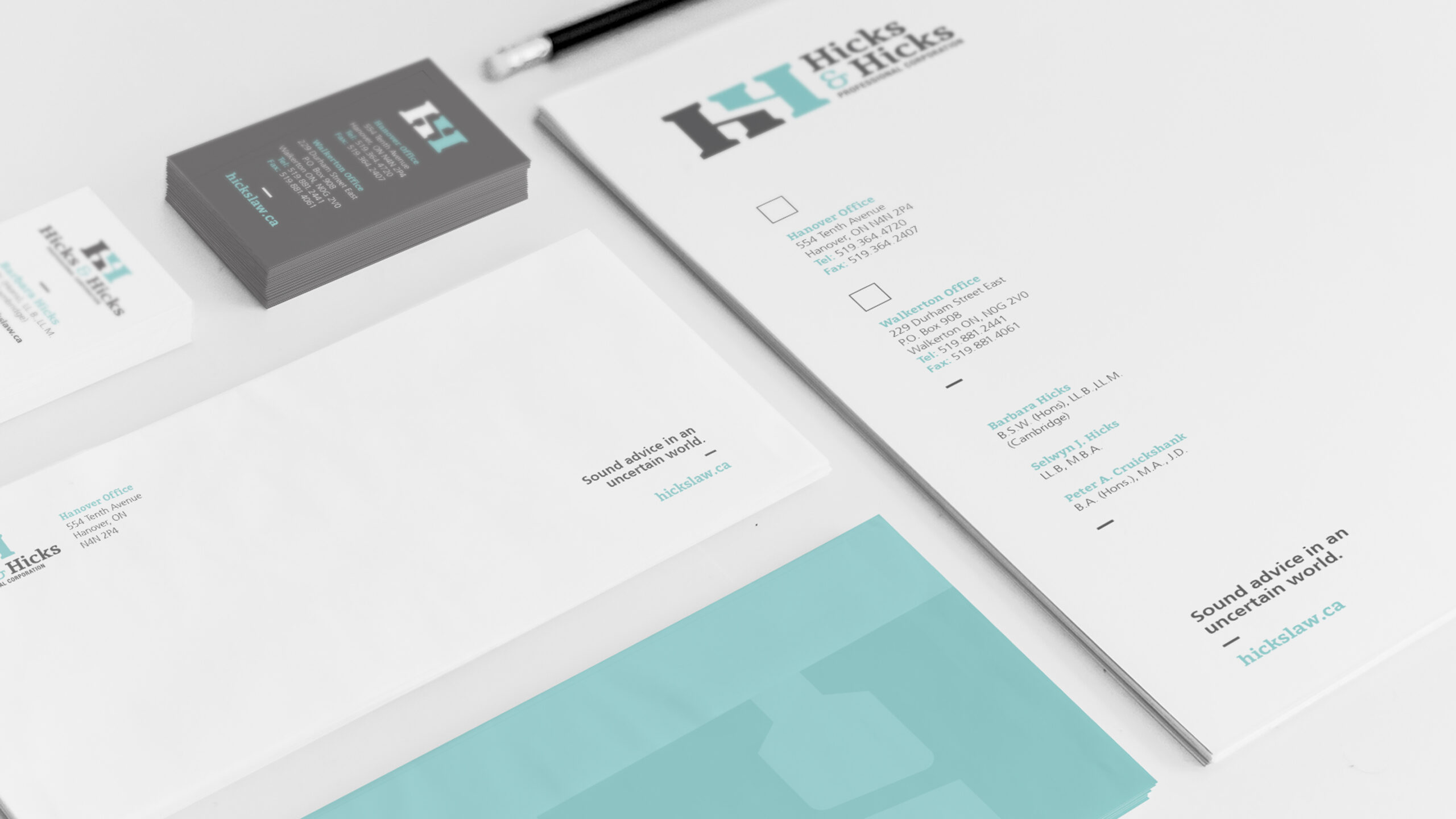
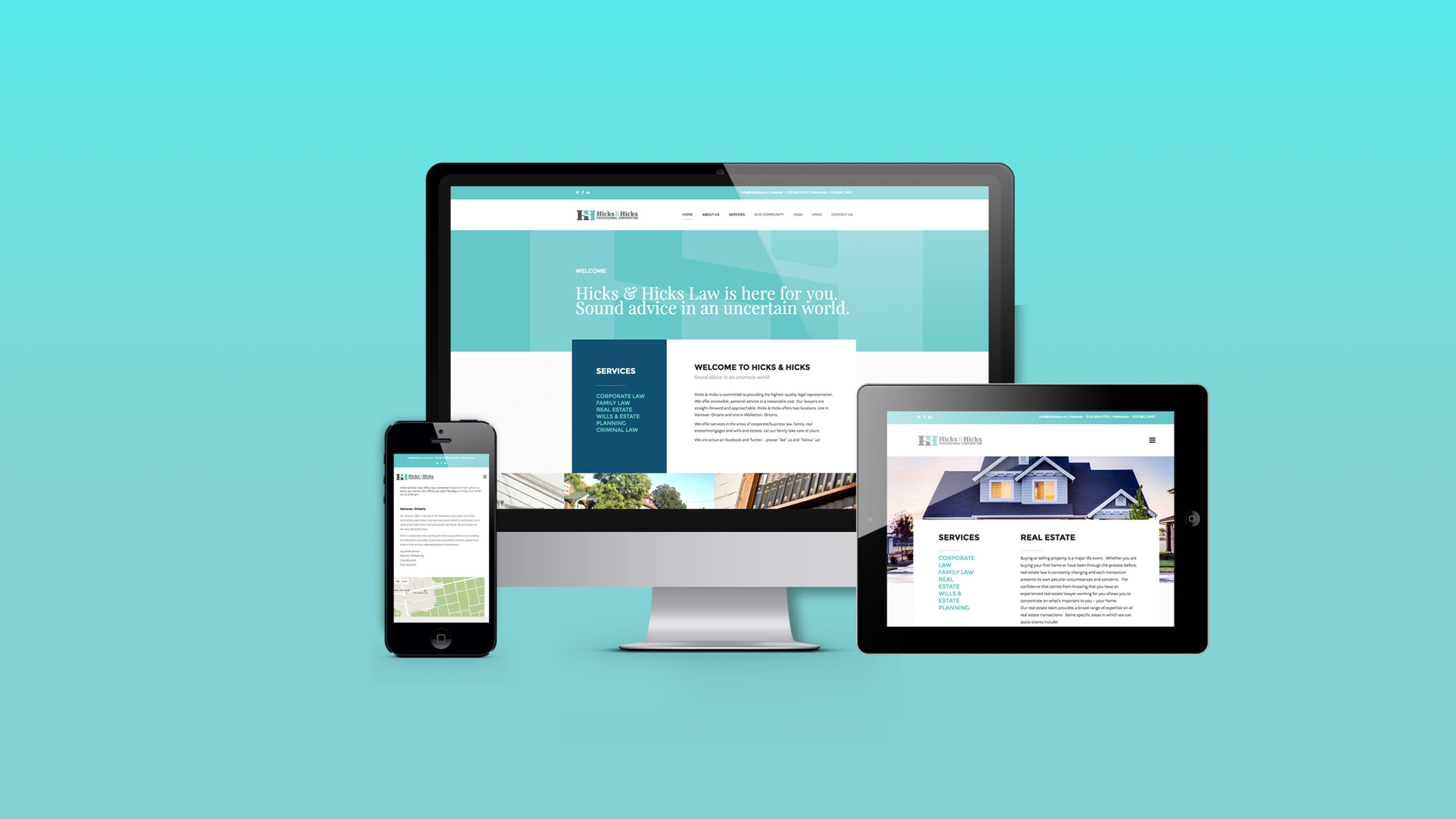
This enabled the creation of a fully responsive website, as well as a stationery suite: business cards, letterhead, envelopes, and internal documents that helped the team, and more importantly their clients, feel that identity from the inside out.