Overview
Residence Life at the University of Guelph shapes the experience of students who choose to live on campus. There is a sense of belonging that comes with choosing to live in residence. The university already had a strong, established identity that represented the institution well as a whole.
The Challenge
Residence Life saw an opportunity to build a companion identity – one that spoke directly to the residence community, with its own energy and personality. They wanted the people living in residence to feel proud of where they lived and excited by what surrounded them. They needed a brand of their own. The challenge was to build a distinct companion identity for the residence community – one that captured the energy and excitement of living on-campus.
The Solution
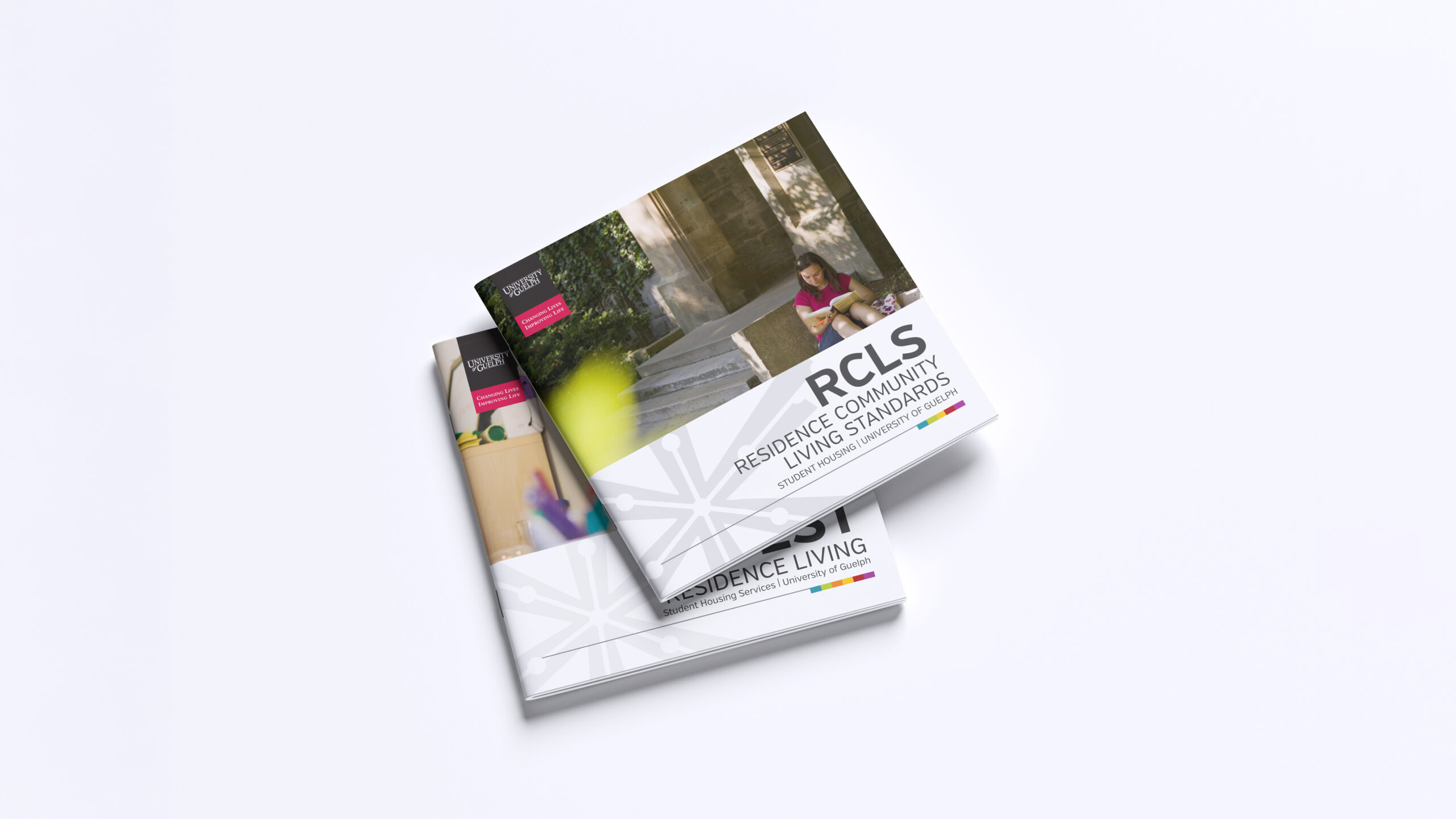
Excitable energy doesn’t sit still – which meant the logo couldn’t either. The final result – a bold starburst mark designed to feel like an eruption of energy, matching the spirit of the residence community it represented.
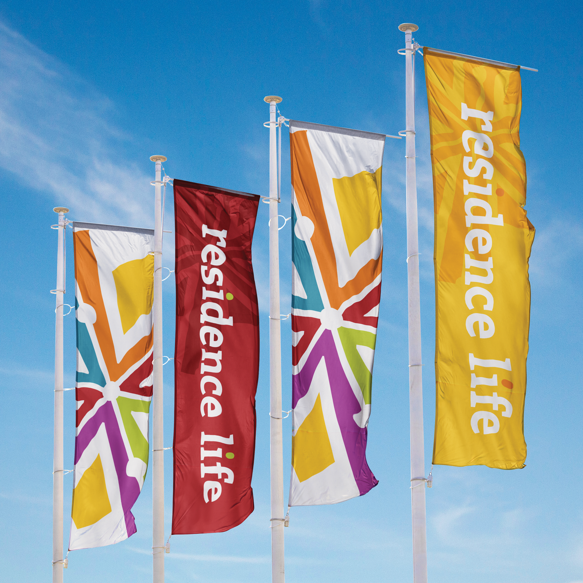
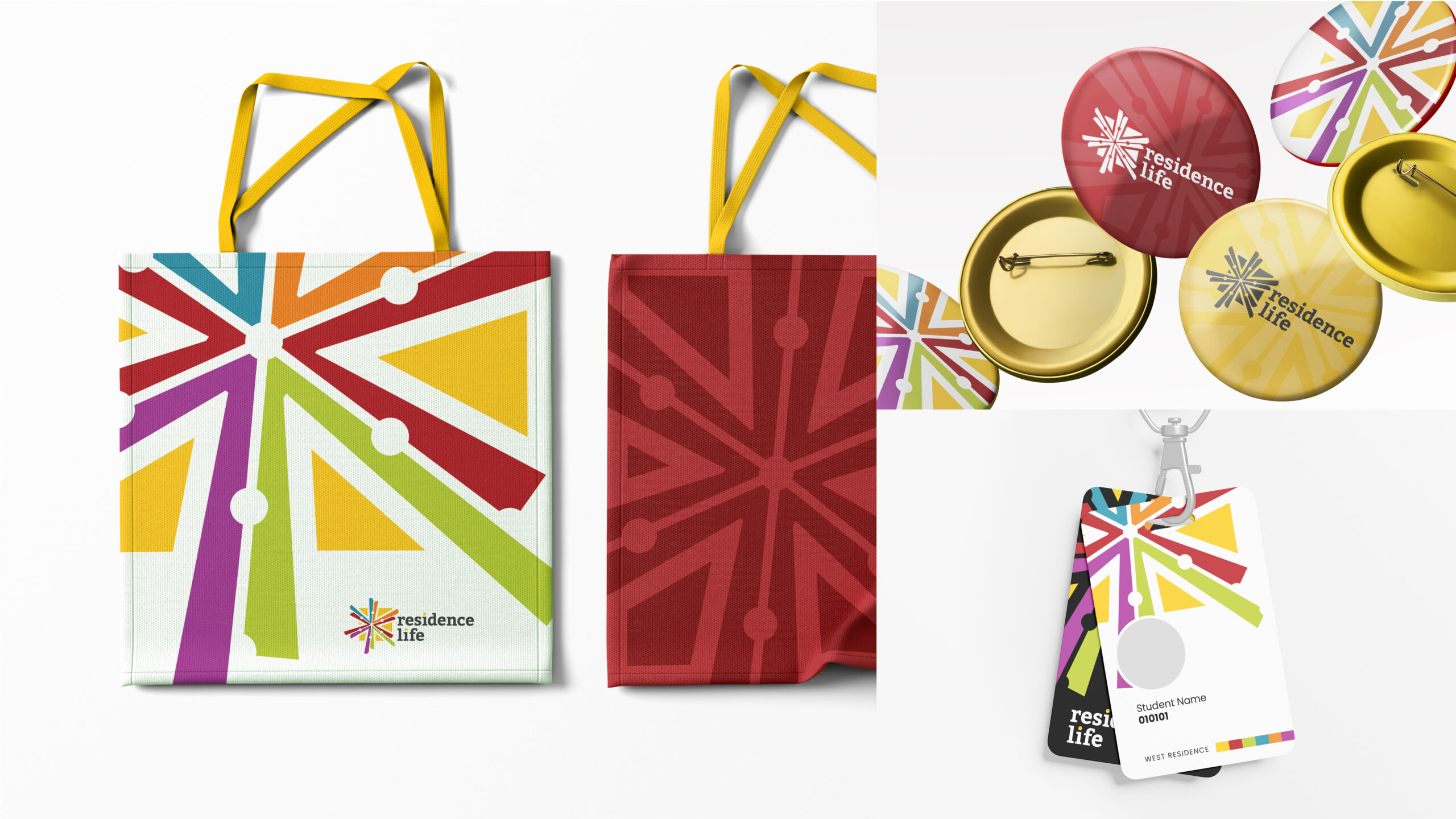
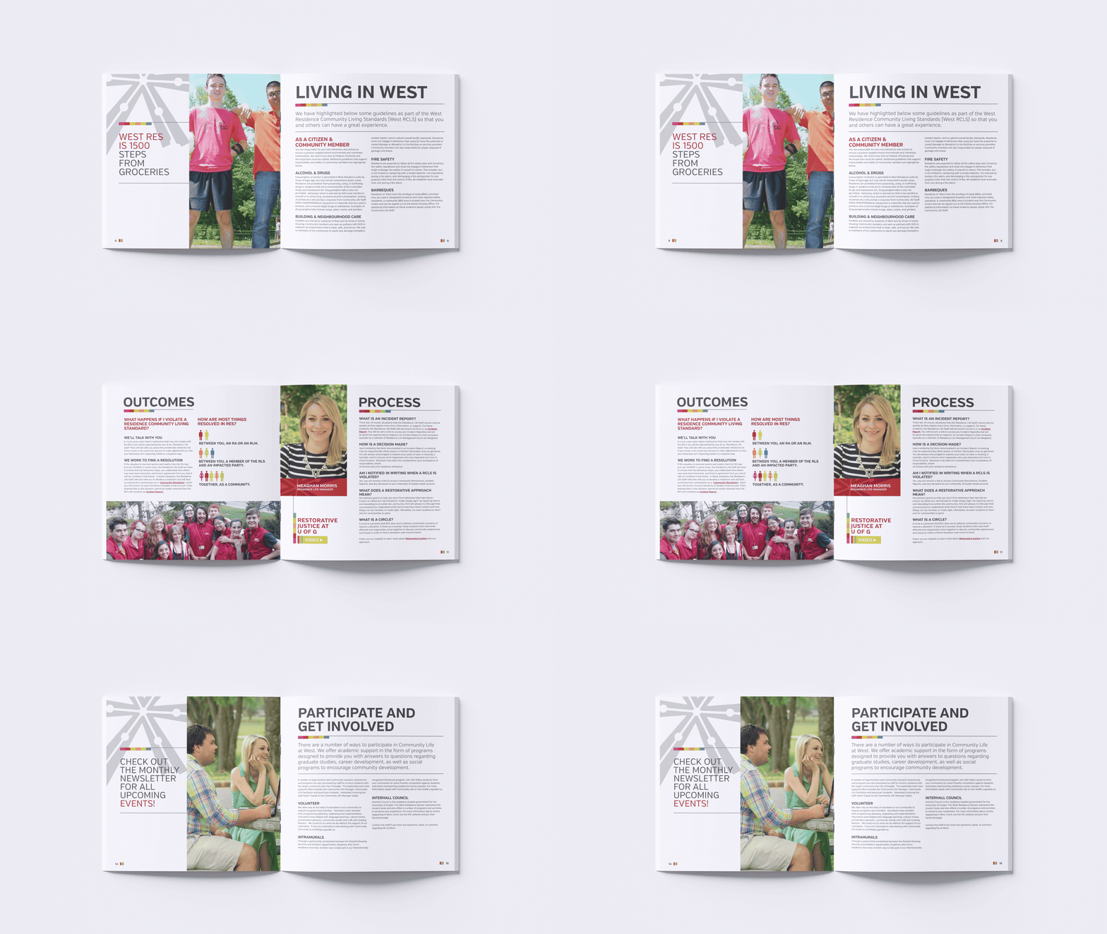
The colour palette breathed life into the starburst – mixing yellows, oranges, blues, reds, limes, and purples into an identity system that could shuffle combinations without ever losing its meaning. The starburst logo also doubles as a pattern, a background, an overlay, something that could stretch across any visual medium that it came in contact with.