Overview
Hanover and District Hospital, situated in Hanover, Ontario, operates as a vital regional healthcare hub. Its service area extends far beyond the town borders, providing essential medical care to a cluster of rural and smaller communities across a wide catchment area. Backed by an active hospital foundation, the organization sought to elevate its regional presence and build community engagement. This institutional momentum coincided with a broader municipal transition; the previous year, a new corporate identity had been established for the Town of Hanover, featuring an “H” embedded with a floating leaf motif. Following the widespread success of that civic brand, the hospital required a modern visual identity that could integrate this shared community narrative while supporting long-term institutional growth.
The Challenge
While the hospital’s legacy identity had served the organization for decades, it lacked the technical versatility required for an expanding digital footprint and broader community outreach. A major part of the challenge was designing a logo system that worked seamlessly for both the hospital and its fundraising foundation, which needed to project a unified yet distinct philanthropic presence. Strategically, the brand had to create a direct visual link with the newly established Town of Hanover identity. The design requirement was to develop a cohesive, modern regional narrative without abandoning the recognizable blue palette and trusted heritage that patients associated with local medical care.
The Solution
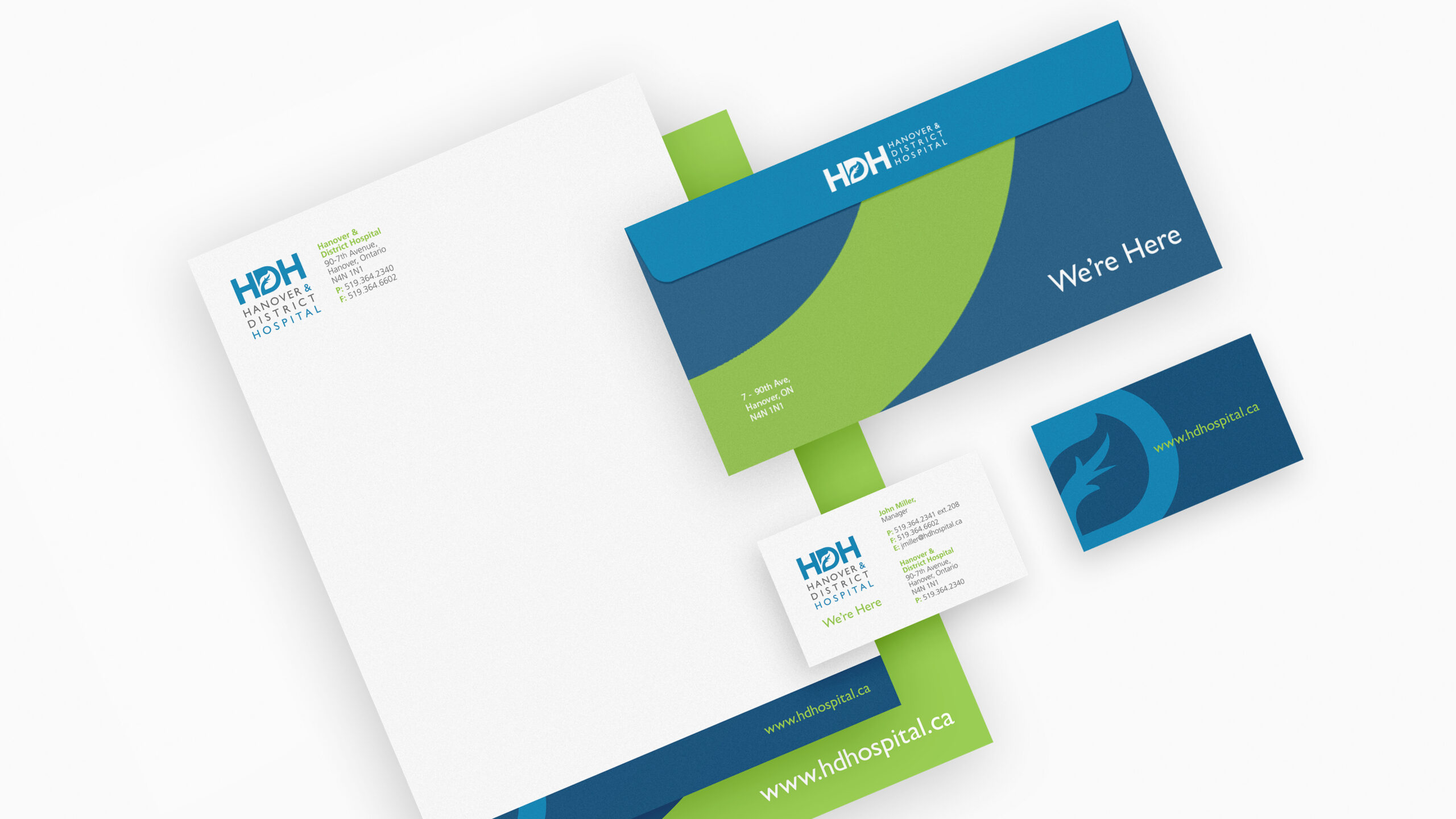
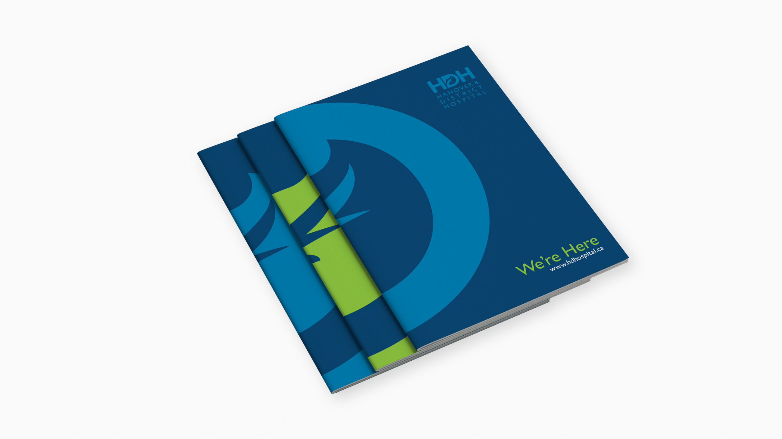
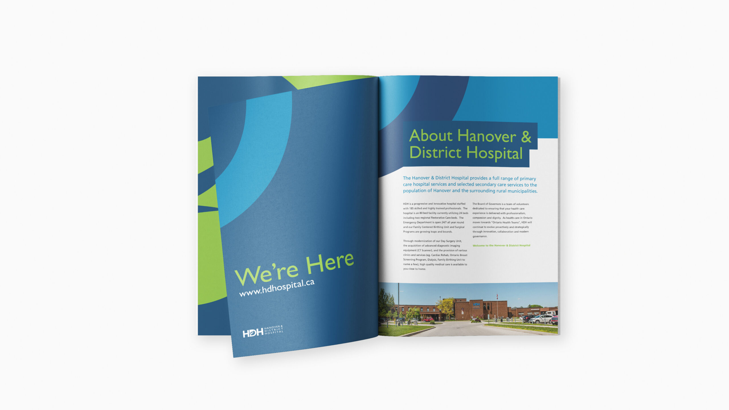
The goal was to create a cohesive design system that unified the hospital, its foundation, and the broader municipality. The Town of Hanover’s leaf motif provided the ideal starting point, serving as a visual bridge to the rest of the community. By pairing the town’s vibrant green with the hospital’s trusted legacy blue, the new identity achieved instant local alignment while remaining comforting and familiar.
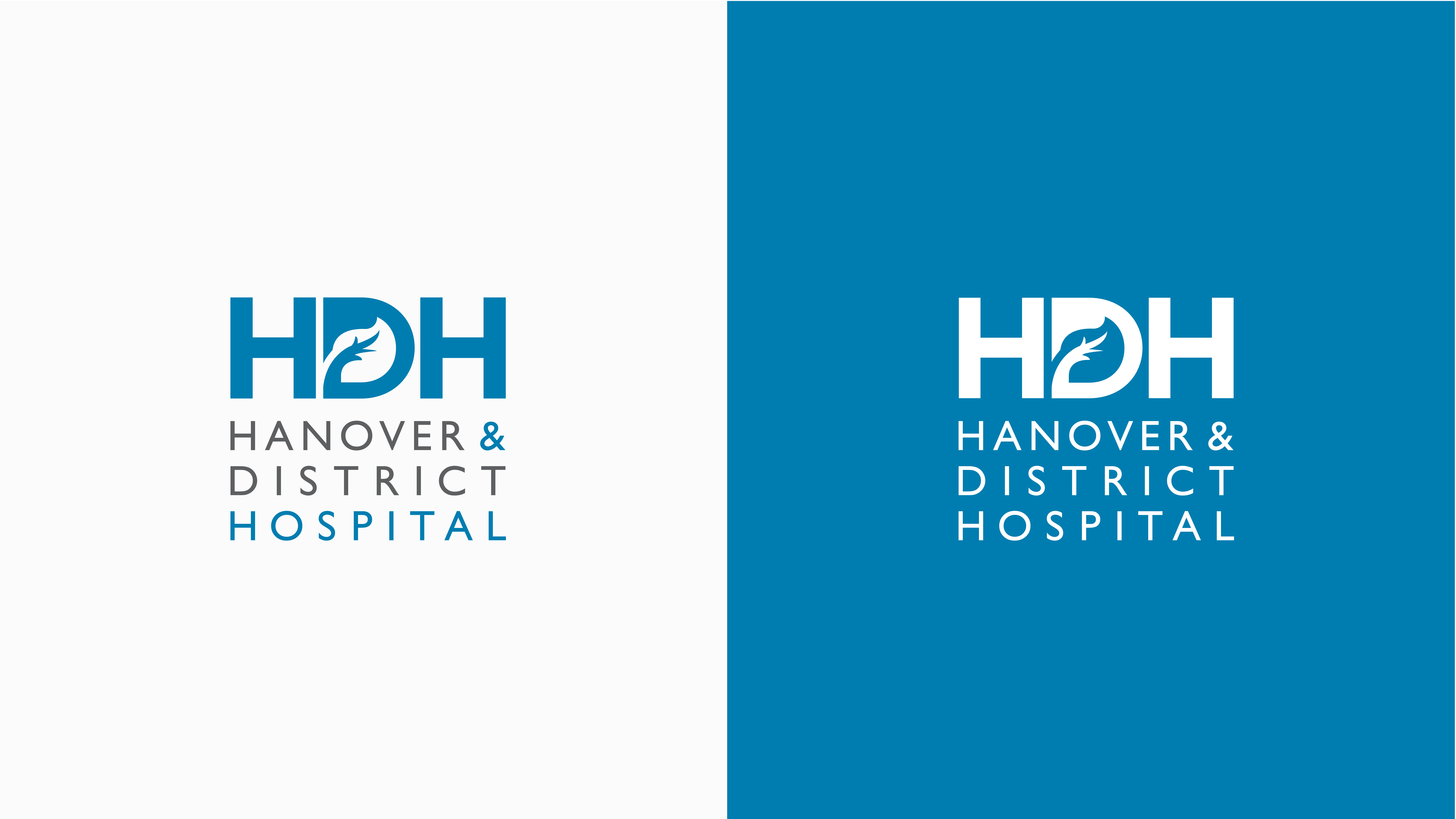
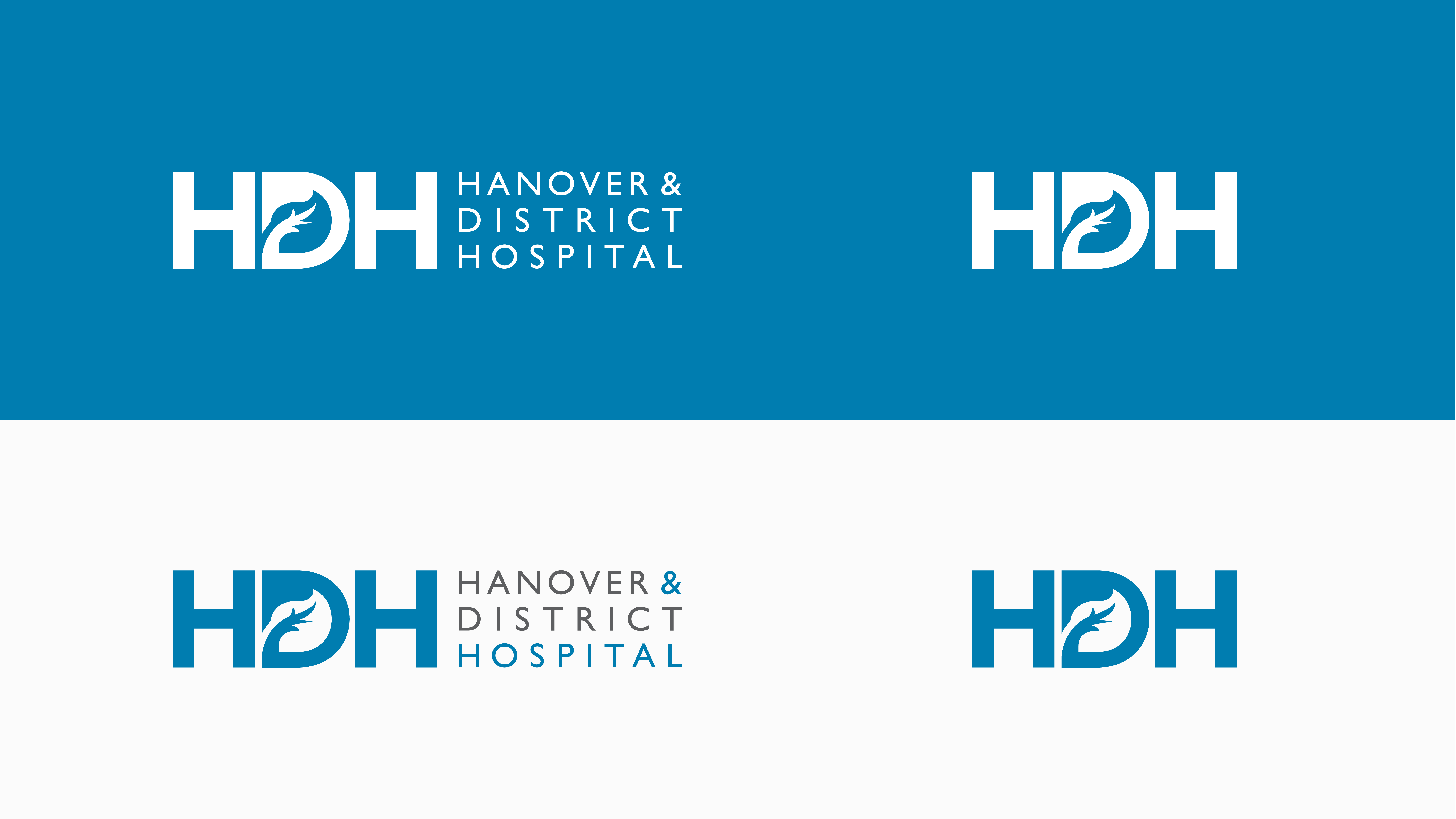
To accommodate the two separate entities, the brand architecture was split into two distinct paths: The Main Hospital Mark: The primary logo was engineered as a high-performance corporate identifier, built out in versatile stacked, wide, and reversed monochromatic configurations to ensure consistent brand delivery across all healthcare operations and digital platforms.The Hospital Foundation Logo: A specialized, simplified sub-brand was developed for the philanthropic arm, providing a distinct visual identity tailored for fundraising and community outreach while maintaining an undeniable structural link to the hospital.