
Overview
Conestoga College is a large post-secondary institution based in Kitchener, Ontario, with campuses and programs across southern Ontario. As the college grew, so did the number of schools, departments, and service areas creating their own marketing and communications materials – often without a formal brand standards guide. Over time, the identity began to drift: logo treatments varied, colours shifted, typography became inconsistent, and departments sourced their own icons and design elements. Some materials felt distinctly Conestoga; others did not.
The issue was bigger than aesthetics. Every flyer, billboard, digital ad, presentation, publication, and event material contributes to how the college is perceived. Inconsistency weakens the recognition and trust that come from a strong institutional identity. At the same time, the core brand could not simply be replaced: the logo and black, white, and gold palette were already established across hundreds of applications. This was not a rebrand. The opportunity was to build the structure around what Conestoga already had, creating a system that could bring consistency across the institution without losing the familiarity of the existing brand.
The Challenge
The challenge was to create a brand structure and system that could work across the entire institution while still being simple enough for people outside the marketing department to use correctly.
The guide needed to do two things at once:
- Educate non-designers on how and why the Conestoga identity should be used in different situations,
- Create clear standards that designers, departments, and external vendors could consistently apply,
The Approach
Years of experience inside Conestoga’s marketing department meant the project was grounded in more than a visual audit. It drew on institutional knowledge: where the existing brand worked, where it consistently broke down, and how different departments actually used it. The existing identity also came with limitations. The logo has a thin wordmark and a significant scale difference between the icon and typography, which creates legibility challenges at different sizes. The gold palette has its own restrictions, particularly when reversed or paired with other colours. The goal was to work within those limitations without changing the core elements people already associated with Conestoga.
Accessibility was considered from the beginning rather than added later. So was adoption. Any new system would ultimately need support from senior leadership, departments, committees, designers, and external vendors. That meant the guide needed to feel like a natural evolution of an identity people already knew, rather than a completely new direction. The result was intentionally practical: enough structure to create consistency, but simple enough to be repeated by hundreds of people across the organization.
The Insights
At institutional scale, brand consistency is as much a people challenge as a design challenge. A standards document only works if people understand it, trust it, and can realistically apply it. For that reason, the guide became as much an education tool as an enforcement tool. Rules were supported by context and examples so users could understand the reasoning behind them. The project also highlighted the tension between customization and reproducibility. With multiple designers, departments, agencies, vendors, and non-designers all working from the same system, every decision needed to be flexible enough for different applications while still being simple enough to execute consistently. The strongest brand system was not the one with the most options. It was the one people could actually use.
The Solution
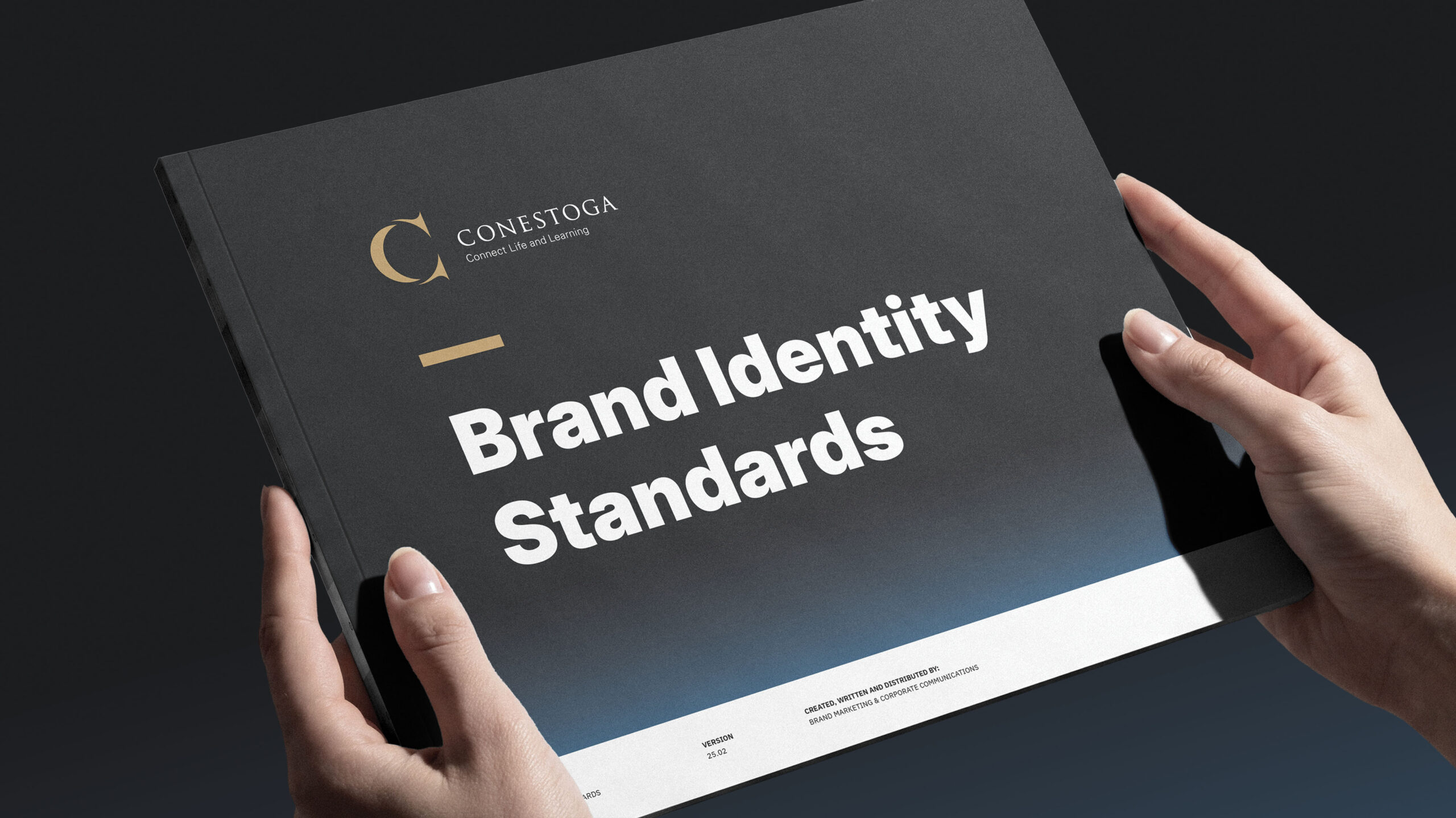
The approach was to build upwards, not start over. The existing logo and primary colours stayed intact, while a broader visual system was created around them to bring greater consistency, flexibility, and accessibility to the brand. The final guide was organized around the core elements needed for everyday brand application: logo variations and applications, typography, colours, photography, and asset resources.
For the logo, the system established clear standards for orientations, sub-brands, tagless versions, minimum sizing, clearance, reverse applications, and legacy marks. Specific treatments were introduced to help protect the logo’s readability, particularly when used on black or in visually busy environments.
Typography was formalized using the font ‘Inter’ for headlines and the font ‘IBM Plex Sans’ for body copy. Consistent leading and styling rules were established so typography could be reproduced accurately across departments and applications. A dash element was also introduced as a recognizable graphic detail within headline treatments.
The colour system expanded beyond black, white, and gold through carefully defined tints and shades, along with blue, cream, slate, and a brighter ‘digital blue’ for screen-based applications. Blue had historical roots within Conestoga’s identity, allowing the palette to expand without feeling disconnected from the institution’s past. A black-to-blue gradient was also introduced to reduce reliance on solid black while maintaining the strength of the core palette. Weighted colour guidance established how prominently each colour should appear, helping teams understand not only which colours they could use, but how much of each colour felt distinctly Conestoga.
The guide also established standards for photography, accessible print and digital design, merchandise, printing, and asset resource management including: a custom icon library that gave departments a shared visual language instead of relying on inconsistent third-party assets.
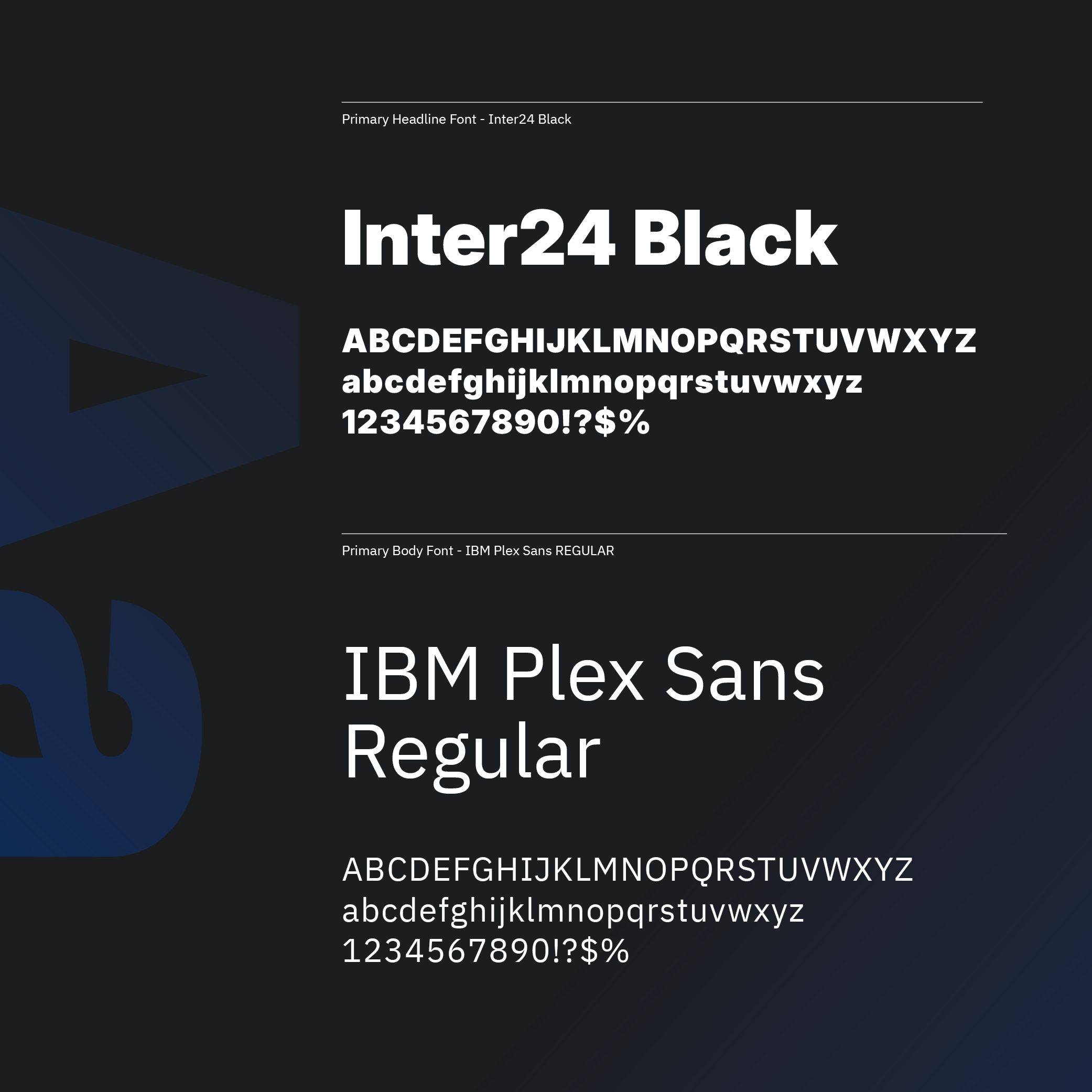
The fonts ‘Inter’ and ‘IBM Plex Sans’ form the typographic foundation of the Conestoga identity. Both are sans serif typefaces with enough shared characteristics to work together while remaining visually distinct. ‘Inter’ leads headlines, while ‘IBM Plex Sans’ supports longer-form copy, creating a system that is clean, readable, and flexible across print and digital applications.
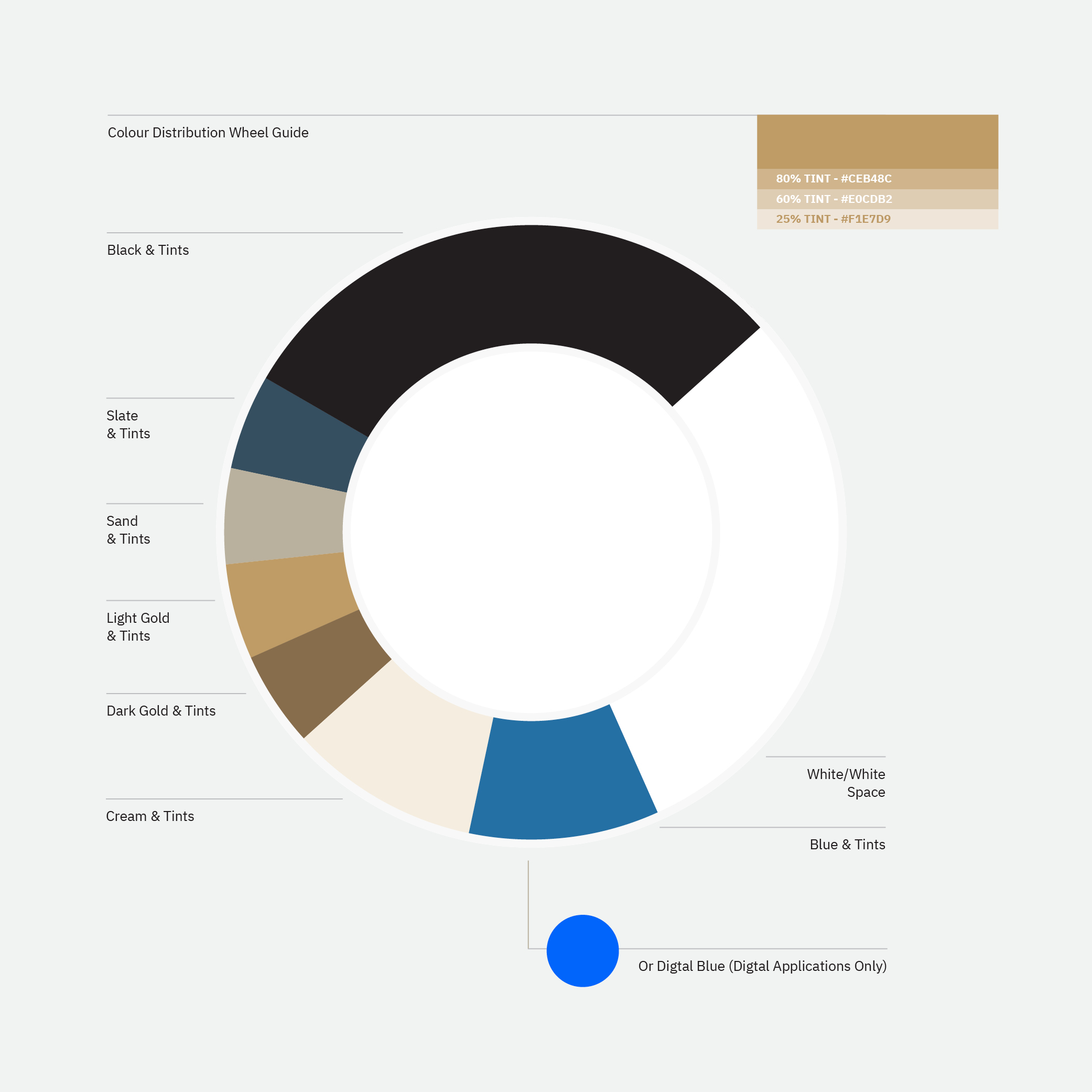
The weighted colour wheel shows how much visual prominence each colour should carry within the brand. Gold and black remain primary, blue and cream act as secondary colours, and tertiary colours are reserved for smaller accents such as flourishes and pull quotes. It gives users an immediate sense of what should, and should not, dominate a Conestoga application.

The custom icon library created one shared visual vocabulary for the college. More than 160 icons were developed across four colourways, giving schools and departments a consistent alternative to sourcing unrelated graphics.
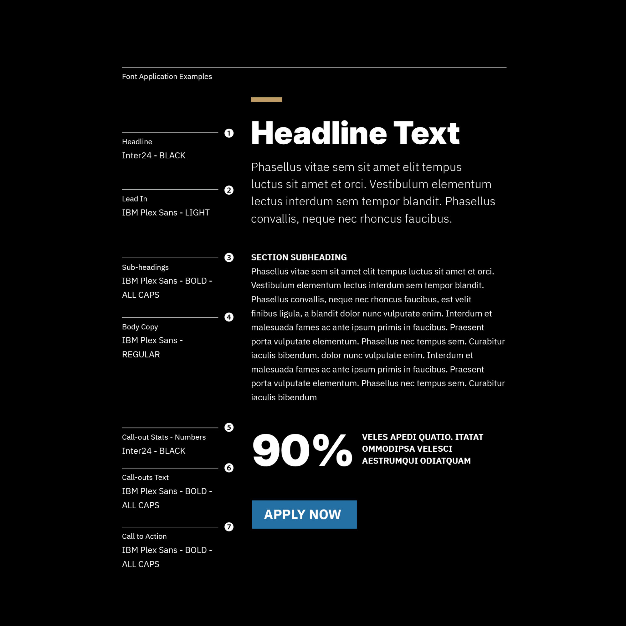
The typography system in application: ‘Inter’ and ‘IBM Plex Sans’ working together alongside the dash graphic introduced as part of the broader identity. Clear examples demonstrate how each element should be used, helping users move from brand standards to consistent execution.
Outcomes
- A 68-page brand standards guide organized across six core areas: logo, logo application, typography, colour, photography, and resources/policy.
- A complete logo application system covering orientations, sub-brands, tagless versions, minimum sizing, clearance, reverse treatments, and legacy marks.
- A formal typography system using the fonts ‘Inter’ and ‘IBM Plex Sans’, with defined styling and formula-based leading.
- A new signature graphic device — the dash — incorporated into headline typography.
- An expanded colour system including tints and shades of black and gold, a blue palette, digital blue, cream, slate, and the Conestoga gradient.
- Weighted colour-use guidance to protect the prominence of the core identity.
- Photography standards defining focus, composition, and content expectations.
- Accessible design practices for both print and digital applications.
- A custom library of more than 160 icons across four colourways.
